- Author: Shadostruct
- Date: December 16, 2022
- Updated: December 16, 2022
- Expansion: World of Warcraft
Whether you’re a new player or an older one looking to change it up from the default UI experience, there’s a lot to consider when building a UI. Thankfully, things are a bit simpler now as Blizzard’s default UI has collapsed a lot of features that third-party addons used to handle, but this guide will make the whole process a bit less overwhelming, hopefully. Even though Blizzard’s default UI has expanded its functionality significantly, there are addons I’d still recommend as crucial — you will find them listed in the guide.
Keep in mind that everything said here is more of a suggestion or information to mull over when deciding what you think your UI should look like, and ultimately UIs are subjective and personal.
Critical Addons
BigWigs / Deadly Boss Mods
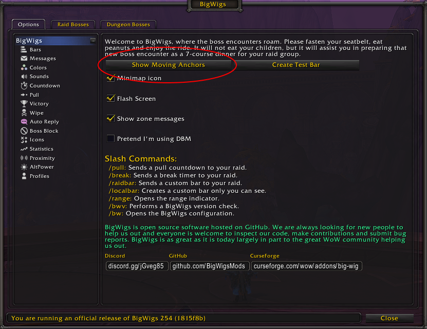
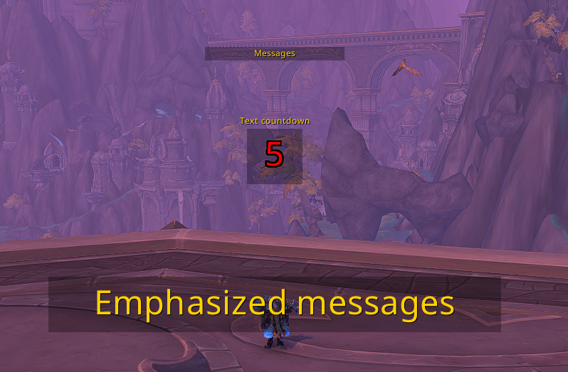
Personally, I suggest BigWigs for the ability to customize and move alerts/cooldowns/etc. around: what it offers is much simpler and more of a click n’ drag type style. That being said, Deadly Boss Mods has been around forever and is definitely respectable in its own right. Use whichever you wind up preferring, or whichever your raid leader might require.
Bartender4
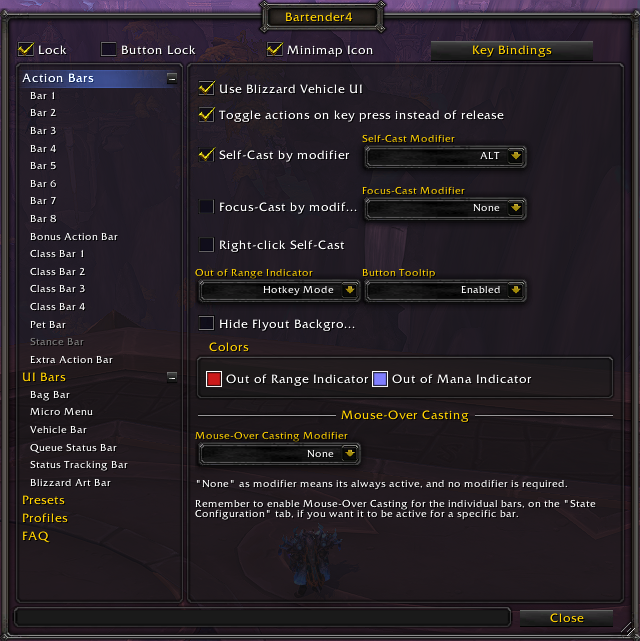
The Bartender addon is of the utmost importance for making formatting and customizing your ability bars and certain other button bars in the game extremely simple, yet very in-depth. The ability to move your bars, add more bars, make them fade out/in by mousing over them or when entering combat, and the ability to easily bind your bars to keys are all core features of this addon.
There’s a lot to play around with in this addon, but I’m not here to dictate what your aesthetic preferences are — simply to help you form a UI that conveys the information to succeed quickly and efficiently!
Details! Damage Meter
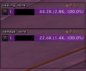
There was a time when several damage meters were vying for competitiveness, but I feel like that time has ended with Details! taking the top spot by a wide margin.
This is a powerful tool that offers far more than just damage numbers, though, so don’t think I’m recommending this simply for the DPS players. Not only can you customize the aesthetics of your meter quite a bit to fit in with the style you’re going for, but it’s a powerful tool to see what did damage to you during an encounter, if you’re interrupting the right casts, and much more.
Leatrix Plus
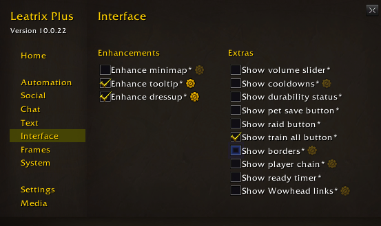
Leatrix is the ultimate collection of quality of life changes, UI tweaks, and ease of use options combined into one simple addon. While there are a lot of options combined within this one addon, the vast majority are going to be up to your personal preference.
The options are sorted on the left-hand side and, when mousing over the different option boxes, you’ll get a tooltip explaining what type of change each one offers. There are certain pieces of the UI you might want to move that are still not enabled to be moved through the default Blizzard UI, and this addon will allow you to do that among other helpful changes.
WeakAuras
Weakauras is probably the most powerful addon in all of WoW with the capabilities it has. It is almost like a framework that allows addons to be made within this addon! But don’t go sweating the details or getting worried about the complexity this addon has, because most of the groundwork has already been done for you by other users if you’re not so technically inclined to deep-dive in it yourself.
The online database for public WeakAuras can be found at Wago.io. This guide isn’t going to focus on this addon as much, although I’d still call it crucial to have. This will allow you to fill in any user-specific gaps that might not be able to be generalized in a guide like this, as well as offer tools for specific bosses.
Edit Mode and You
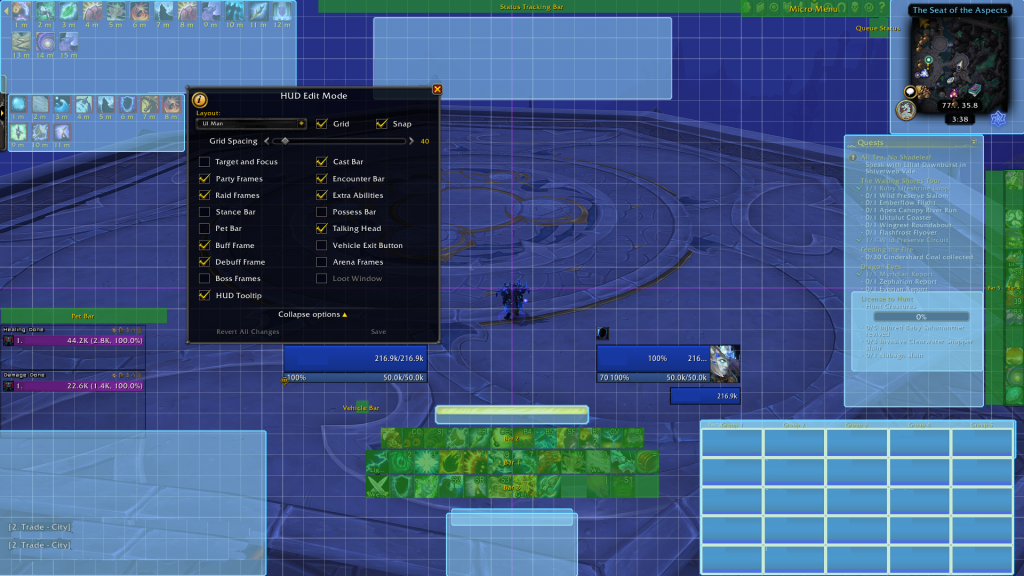
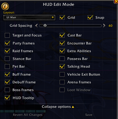
Feel the healing energies pouring through you, relax your chakras to let this energy in, and begin to open your third eye. Or just hit Escape and click the “Edit Mode” button.
Props to Blizzard, as what they’ve offered is quite easy to use. The one downside is it doesn’t cover everything you might need, although it’ll take care of 99% of our needs when combined with your handy Bartender addon.
Presets and Profiles
So you’re in edit mode but the anxiety of potentially moving something, somewhere and just plain not liking it is paralyzing you. No worries! Here’s a few tips so you can experiment freely:
- Once in edit mode keep in mind that there are a couple of default presets that you can always go back to if you were using a default UI.
- If you were not using a default UI I’d recommend saving your current UI to a profile before moving things around just so you have that safety cushion.
- You can have multiple UI profiles — if you play multiple characters/specs, customize your UI to best suit what you’re currently doing.
Options Within Options
- I’d suggest increasing Grid Spacing value (I have it set to 40) to make your adjustments a bit more precise.
- Some UI elements are not ticked in Edit Mode by default and won’t show up as available to customize until they’ve been ticked.
- If you want options for a specific frame, or to know what one cyan box might be compared to another, you can give a single left click and the name of the element will appear in the box, and a separate options box will pop up.
- For some UI elements it will only allow you to change where they are and nothing else, but for others (Like Raid frames for instance) it will offer quite a few more options to fine-tune things in a way you like.
- You’ll notice that Bartender also hooks into Edit Mode and allows you to move any UI elements under its control in this mode as well.
It should be noted if you have more extensive UI addons like ElvUI and such that it’s likely better to use the options menu in those addons to adjust positioning as they’ll override the default Blizzard UI features to inject their own.
The Importance of Positioning
Every WoW player should know that positioning is important! And that not only goes for raid mechanics — it also goes for how your UI is set up. There is a method to the madness here, and I’m going to give some tips and information to be considered when forming a brand new UI. I’ll use my own UI to give a working example, below, just keep in mind that this is general advice that is applicable to any UI and mine is a little less than default.
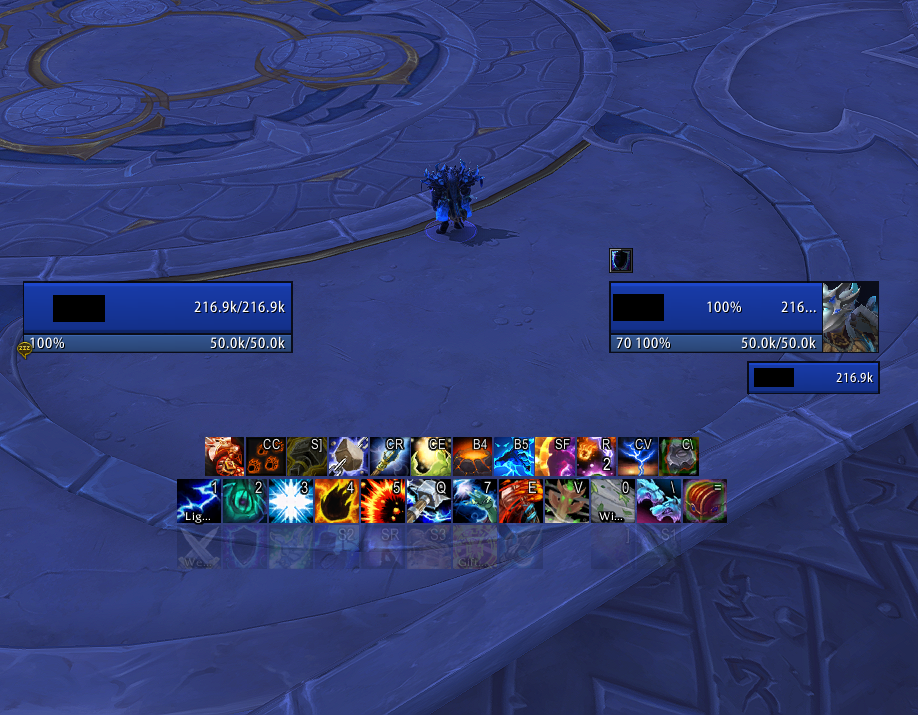
There are a couple of things to focus on here:
- My frames are positioned slightly below where my actual character is.
- There’s a wide spacing between my own frame and the frame of what I’m targeting (which happens to be myself in the screenshot).
- For the corners of the screen you usually want to allocate non-combat, unessential, or utility pieces of your UI, like bags or the chat frame.
The reason I recommend this is so that your UI elements are not impeding what’s around your character. In raids you want the floor around you to be clear so you can see those big red swirlies, circles, and flames so as to avoid them. This type of positioning also has the benefit of keeping your eyes mostly to the center of your screen. With the slightest movement of your eyes you can see all the important details you’d need without taking your eyes off your own character completely.
User Specific Positioning
Setups are going to vary from person to person based on what they’re trying to accomplish, what content they’re seeking to challenge, or even which eye is your dominant one! Those lucky dogs who have a bigger monitor resolution than 1080p even get more real estate to work with – so don’t fret as there is no “correct” here.
For people interested in WeakAuras there are class and specialization-specific ones that will track your main abilities, big cooldowns, casts, and any resources your class might build or spend. Many competitive players that use these tend to put them in that in-between area, in which case I’d likely suggest being more aggressive with how wide and low you make the frames relative to your character.
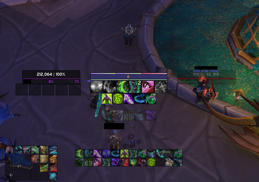
The priority of positioning certain elements is also going to change based on what role you’re taking on. My UI is built around being a DPS, so my raid frames are in the bottom right of my screen. This allows me to see what’s going on at a glance, but it’s unnecessary for me to devote my whole attention to it. For a healer this is going to be a much higher priority, so I’d suggest a more centralized positioning for raid frames.
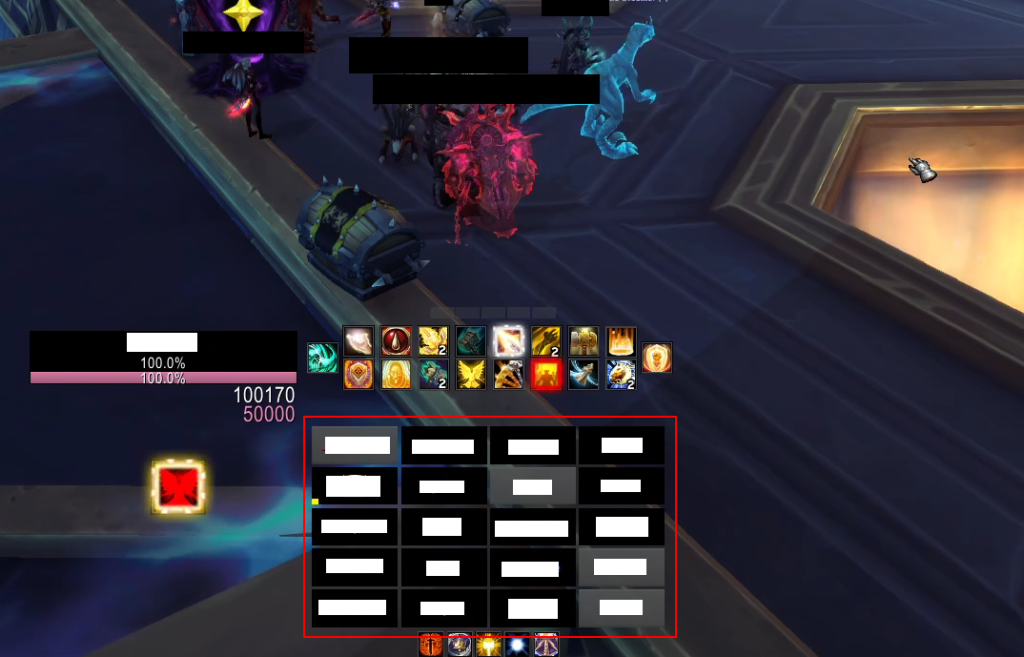
Below you’ll see a friend of mine that plays Holy Paladin has his raid frames centered, but still out of the way of his character model.
Tips, Tricks, and… Illusions? What are you hiding!?
In this section I’ll just quickly go over a few tips to make things just a touch cleaner. While practicality is, of course, important for designing a UI with the intent of taking on tough content, aesthetics are nothing to scoff at!
Raid/Party Frames
The default Blizzard raid frames are actually quite good nowadays, and I’d just like to highlight a couple of options for them that will make them go from looking glum to glam!
In Edit Mode, if you click your raid/party frames you can:
- Choose whether to have a border on raid frames or not.
- Change the size of the individual tiles that make up your raid group.
- Separate groups vertically or horizontally.
- You can set Party Frames to act like a raid frame (so that party and raid look identical).
For my own UI I differentiate between the two by setting my party to view players horizontally while raid frames are vertical. To get it so instead of that bland green for everyone’s health tiles it’s instead based on their class color, simply hit escape, go to “options” (not edit mode), and under the “Interface” tab at the bottom there is “Display Class Colors” among a few other nifty options.
Bartending Tips
Just add ice and shake 3 tim-… oh, right, wrong bartending. Just a few quick tips on how to use your new best addon!
- Have a bar devoted to important consumables, like health potions, health stones, and pots that will be used in combat.
- You can change the scale of the bar to be larger for easy clicking if you so choose.
- You can change how visible certain bars are in Bartender options (/bt for ease) under the “Visibility” tab.
- You can change whether a bar will hide in or out of combat.
- A bar can appear see-through or even invisible until you mouse over it.
- Typing “/kb” (no quotes) in the chat will open up an easy keybinding function.
- Simply mouse over an ability square (whether it has an ability in it at the moment or not) and key in an input for it to be bound to.
- Make sure to tick the “Character Specific” box if you don’t want it to be for all of your characters.
For my mounts and profession bars – they’re invisible unless I mouse over them, which just makes my UI a bit less cluttered.
Nameplates
For those looking for a bit more customization in this area I would suggest the Plater addon, which I’ll link and discuss a little bit more in the next section. For now I’ll assume you’re using the Blizzard default nameplates (which, personally, I tend to prefer).
- Nameplate options are in Escape > Options > Interface
- It is highly recommended to turn on “Larger Nameplates”
- This option will make it much more viable to keep track of enemy casts and interrupt them
Not-so-Crucial But Addons To Consider
- Shadowed Unit Frames – Not a full UI overhaul, but more of a minimalist option that mainly deals with player/target/boss frames. It’s what I used for my own UI in the screenshots.
- SUI – Another minimalist UI addon that mostly handles a few important frames
- Plater – A powerful tool to fully customize how nameplates appear in-game. You’ll find that many competitive players use this, but the default nameplates are serviceable enough in retail that I wouldn’t say it’s necessary.
- Plexus / Grid2 – Both of these addons come from the same origin — the first Grid. If you’re not content with the default Blizzard raid frames I’d suggest either one of these. They’re very similar, with Grid2 offering a bit more power and customization while Plexus is much easier to use and setup.
- Sexy Map – A powerful tool to give your minimap a makeover. Personally, the default minimap takes up a bit too much space I feel, and I think a square is more space efficient. This comes with quite a list of presets that are easy enough to apply and enjoy, but you can also edit things to your heart’s content!
- Adibags – There’s a plethora of bag addons out there, but I think this one has quickly become my favorite. Powerful, easy to use, and aesthetic!
- LS: Glass – This is purely an aesthetic recommendation, but dang does this thing look great! This will change the default chatbox to look a lot more modern and slick. It has a variety of options to get that perfect feel for your chat.

